
Cyclist Central
Revamping the User Experience
Project Overview
Cyclist Central, an e-commerce website that sells bikes, has found that many customers browse through products but do not make purchases. On average, users open 7 item pages before abandoning the website and 70% of users who do add items to their cart do not make a purchase. The company hypothesized that shoppers are abandoning their site because they are unable to decide which product is best for their needs and they are also required to make an account before being able to make a purchase. To address these problems, I aimed to incorporate features that Cyclist Central was missing. By adding a product comparison feature and a guest checkout, I intended to increase sales conversions.
My role on this project was to spearhead all design initiatives on the project, including discovery and designing interfaces.
Discovery & problem landscape
To get more insight on the Cyclist Central’s problem at hand, I sought to understand the different reasons as to why online shoppers abandon websites while browsing and or abandon their carts and to find what factors impact their purchase decisions.
In my search, I found that common pain points and causes of leaving a site are the lack of product information such as product images or reviews and users being forced to make an account to checkout or having too many screens just to complete a purchase. A significant factor to purchase decisions was being able to compare products with those that are similar. The information found during discovery validated the hypothesis made by Cyclist Central.

Solution Ideation
With the findings from the discovery phase, I decided to add a product comparison feature and a guest checkout. These features would allow users to feel more confident when making a purchase and also allow for a quick and seamless checkout process.
To get ideas on how to implement these features into Cyclist Central’s website, I looked and studied other e-commerce websites that have similar features offered. Websites such as Amazon and Best Buy allow users to compare similar products within a product’s page and Trekbikes allows users to include any four products into a comparison table. Best Buy and Trekbikes also offer a guest checkout.


Brand and Styling
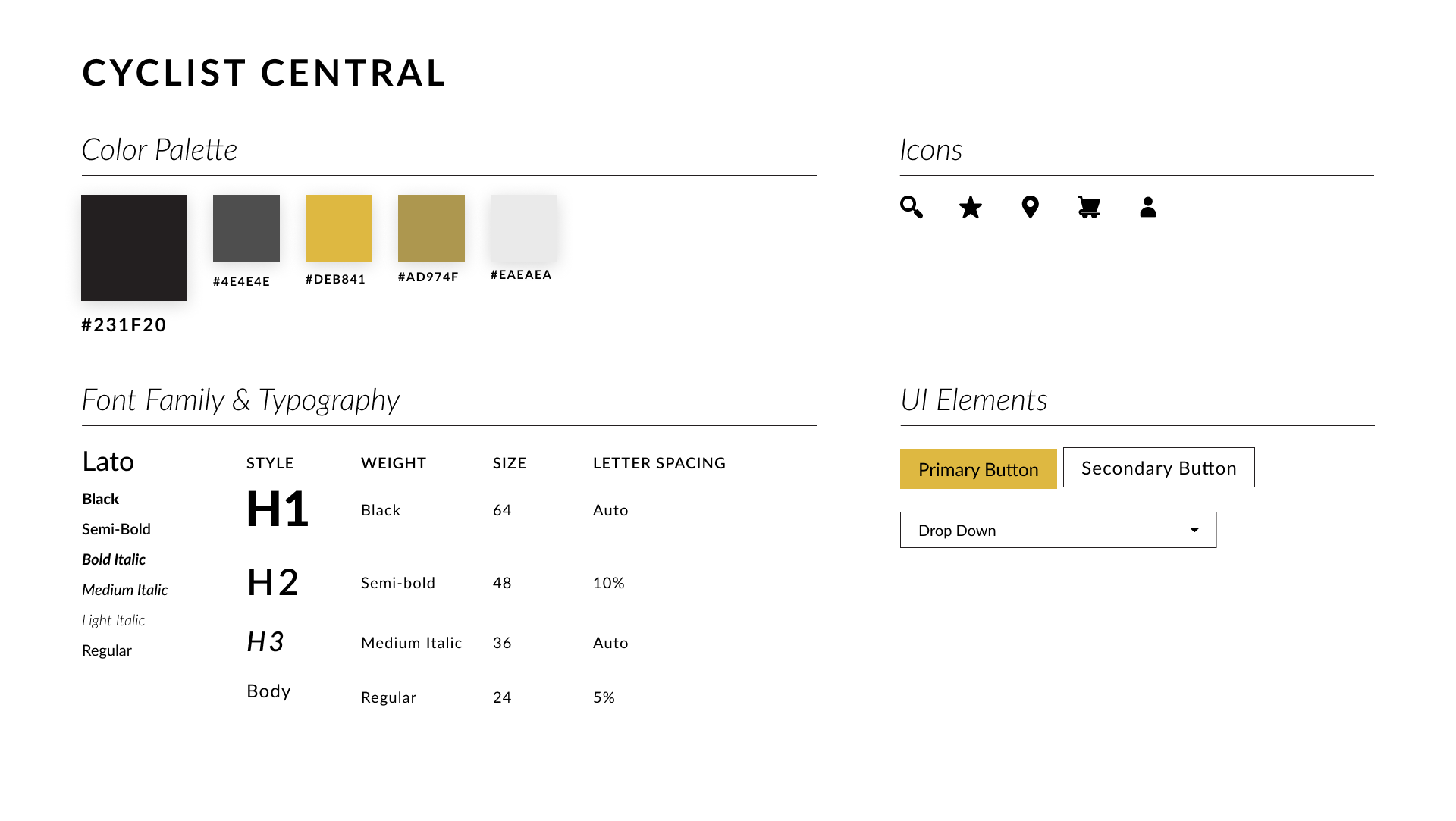
Cyclist Central has a brand that prides itself in being an expert in the biking field. Their brand attributes are savvy, focused, serious, and dependable. To reflect this branding, I decided to use a black and gold color palette when designing. Black and gold are both associated with prestige and trust which can communicate to customers that Cyclist Central is a reliable and high-quality brand. User interface elements such as buttons did not have any rounding to show that Cyclist Central is serious about what they do.
Prototyping
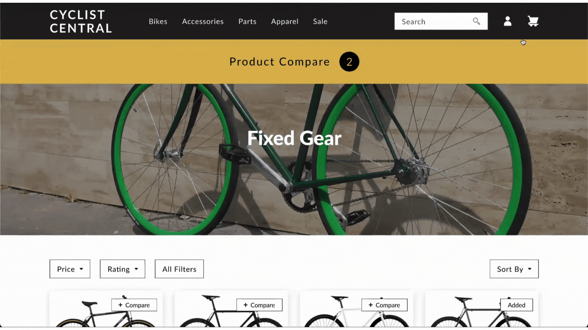
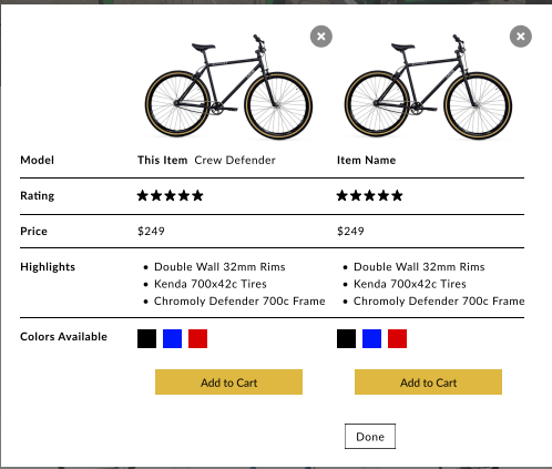
Product Comparison
The main feature incorporated into the prototype was the capability to compare products. Users are able to compare the product they are viewing to similar products within the product’s page but also have the option to select a different product in the website to compare with. These products are then added to a table in a pop-up Product Compare screen.
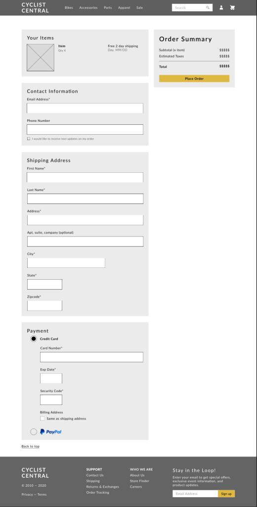
Guest Checkout
Users were also able to purchase items in their cart without needing an account. When the checkout process is initiated, a pop-up comes up and prompts customers to select their preferred Checkout method with Guest Checkout being an option. Once Guest Checkout is selected, they are taken to a single checkout screen to reduce the amount of clicking and pages users have to go through.
Usability Testing Feedback & Insights
All usability testing participants were able to go through the assigned tasks with no issues. Although the main functionality of the app worked as designed, participants were able to provide feedback and find minor areas of improvements. On the Navigation Bar, the search bar text was a light gray against a white background which could be an accessibility issue.
Users also noticed that in the comparison table, there were bikes that had the same information and photo which was a design error on my end.
Learns & Future Iterations
Having to spearhead designing a solution for an existing company has been a great learning experience as a designer. This project gave me the experience of creating a project plan with time frame estimates and choosing which discovery or design methods work best for the project.
While the website prototype worked as planned, there are still many features that could be incorporated into future iterations. For example, having more interactive and animated buttons to create more distinction with user actions. This would help users easily see if their item were added into the cart or added into the comparison table.
