
Hybrid Cloud
Centers for Medicaid & Medicare Services Cloud Services Website Revamp
Project Overview
The Office of Information Technology at the Centers for Medicare and Medicaid Services, or CMS, offers cloud services to various application development organizations (ADOs). Known as Hybrid Cloud, these services allow ADOs to deploy their applications onto the cloud for use within the agency. Information about these services is presented on an internal website designed as a one-stop-shop for all things Hybrid Cloud. The site promotes benefits of app deployment when utilizing their services and products, provides technical documentation, and serves as a communication and outreach channel to current and potential customers.
However, stakeholders observed that website traffic was low and the site was underutilized. It lacked branding, contained inconsistent or outdated information, and offered an unintuitive user experience. To address these challenges, our team aimed to create a brand identity for Hybrid Cloud, redesign the website’s interface, and revamp its information architecture.
My role on this project was to lead all design initiatives including planning and executing user research, rebranding the CMS Hybrid Cloud website, redesigning its user experience.
Discovery & Understanding Users
Defining Users & Use Cases
To discover why site traffic and utilization was low, I sought to understand the existing user experience and identify pain points. I conducted initial discovery calls with current website users. Through these conversations, I uncovered three distinct user groups, each with unique goals and use cases when engaging with the site.
Program/Project Managers
- Explore offerings and costs
- Ensure team selects the products and services best suited for their organization’s technical needs and financial constraints
Developers & Engineers
- Find technical documentation
- Discover products and services to implement into organization’s application
Content & Communications Publishers
- Promote Hybrid Cloud to increase cloud adoption and website engagement
- Provide any updates or information on features, products, or services
Challenges & Opportunities
Although three district user group were identified, their shared pain points revealed overarching usability challenges within the website. These common challenges highlight opportunities for solutions and improvements aimed at delivering a more consistent, intuitive, and user-friendly experience that meets the needs of all users.
Key Pain Points
- Navigation structure did not align with user expectations or mental models
- Important actions such as search and filtering were not easily visible or accessible
- Unclear visual hierarchy and inconsistent design patterns led to confusion and caused users to overlook critical content
Solution Ideation & Additional Research
Initial Solution Recommendations
Restructure Information Architecture
A common pain point was the website’s confusing navigation structure. By restructuring the information architecture to better align with users’ mental models, the site could offer more intuitive be simpler to user.
Add Filtering & Search Features
Many users struggled to locate information because the site lacked search functionality and required excessive scrolling, specifically in the Products and Documentation pages. By introducing a robust search and filtering features, users could quickly find the content they need and create a more efficient user experience.
Create Strong Brand Identity
Inconsistent design and patterns caused users to miss important content, a pain point experienced especially by publishers posting marketing content. By solidifying a brand identity for Hybrid Cloud, it would establish consistent visual cues and hierarchy that not only guide users to key content but also reinforce recognition and trust.
Additional User Testing & Validation
Tree Testing
To evaluate the effectiveness of the current information architecture, I conducted a tree test using the current navigation structure with five participants from each user group. This provided quantitative insights into how users locate content and informed a data-driven approach to restructuring the website. The results revealed that participants only successfully navigated to the correct page for about 35% of the designated tasks.
Card Sorting
During discovery, users frequently identified the Products and Documentation pages as confusing due to poor categorization and excessive scrolling. I conducted a card sort activity with users from each group to understand their mental models and used insights to implement an efficient content structure and filtering system.
Brand Identity
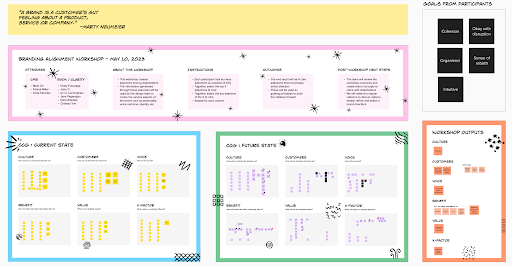
Branding Workshop
My team and I conducted a branding workshop with CMS stakeholders to solidify the Hybrid Cloud identity. Through collaborative exercises, stakeholders defined how they perceive the culture, target customers, brand voice, key benefits, and the website’s unique value proposition. We captured both the current state and the desired future vision, creating alignment around a consistent identity to guide design and communication.
Final Brand Outcomes
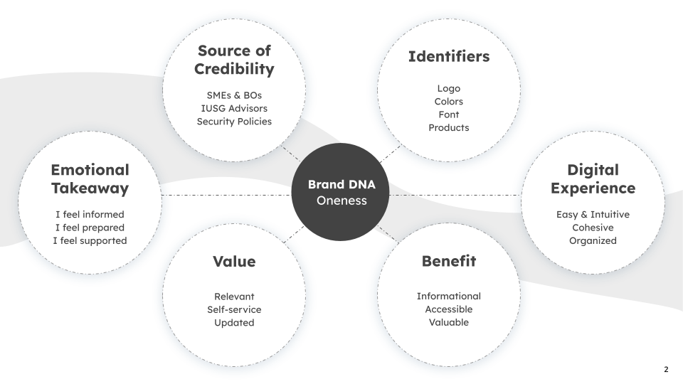
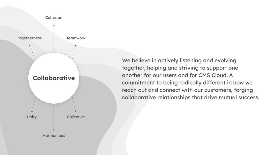
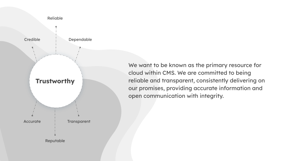
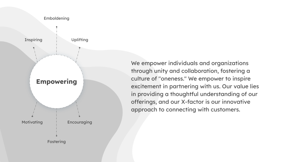
DNA, Tenets & Attributes
Through the workshop, stakeholders were able to define a new brand DNA for Hybrid Cloud, clarifying its purpose, values, and unique differentiators. Stakeholders wanted the Hybrid Cloud brand to have an overarching theme of Oneness. to This became the foundation of the visual identity, content strategy, and overall user experience.


Assets & Logo
To establish a cohesive visual identity, I presented three distinct color palettes to CMS stakeholders for review and feedback. After reaching a group consensus, I collaborated with our team’s visual designer to develop a refined logo and a suite of branded assets that would reinforce the website’s identity and ensure visual consistency across all touchpoints.
Design Outcomes
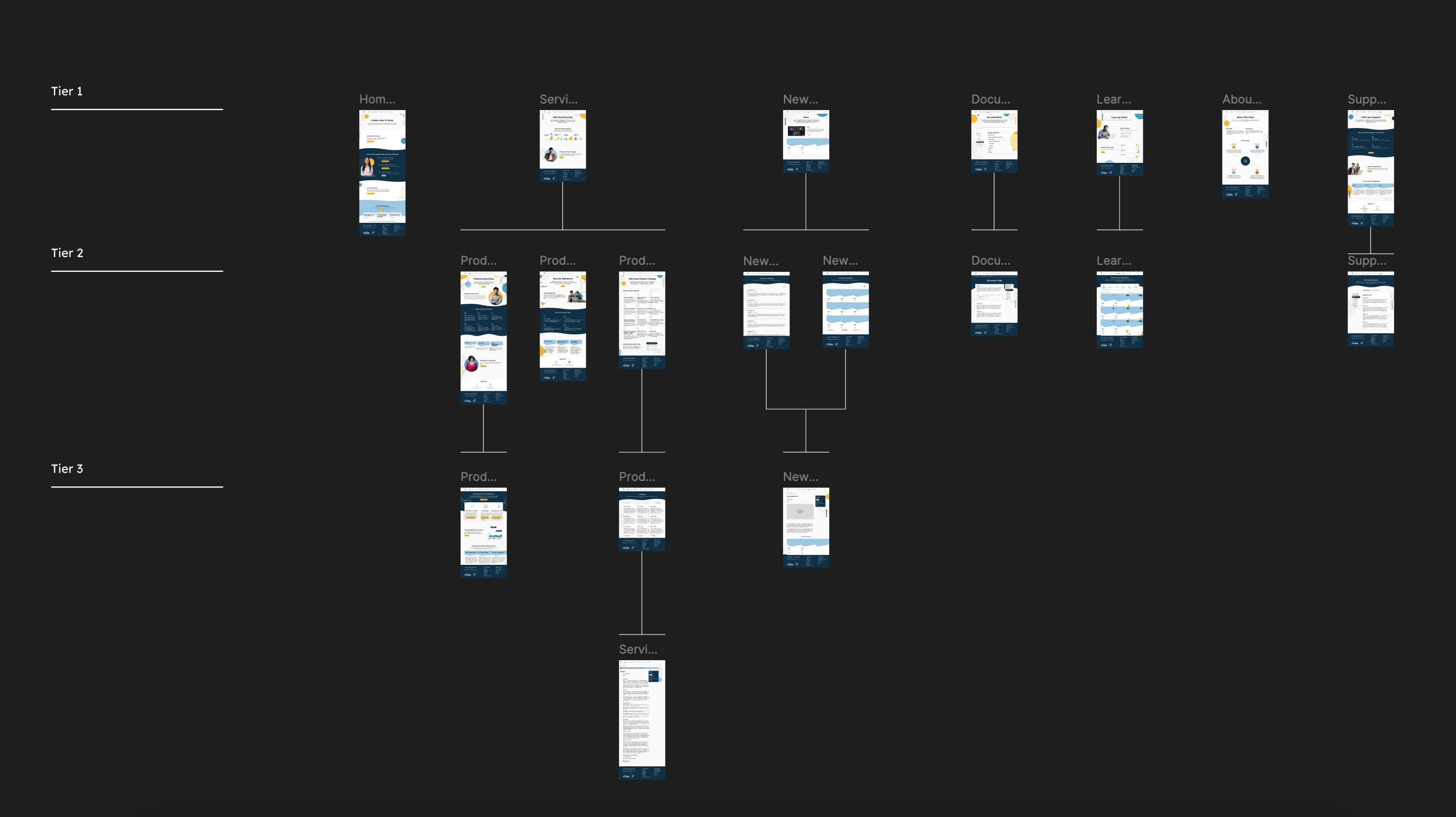
Revamped Information Architecture
Using insights gathered from the discovery phase and tree testing, I restructured the website’s information architecture to streamline navigation and simplify key workflows. The updated structure limited the site to three tiers, except for individual product and services information pages. This redesign created a more intuitive hierarchy and reduced the number of clicks required to reach key content, helping users locate information faster and navigate the site with greater ease.
Implementing Filtering & Search
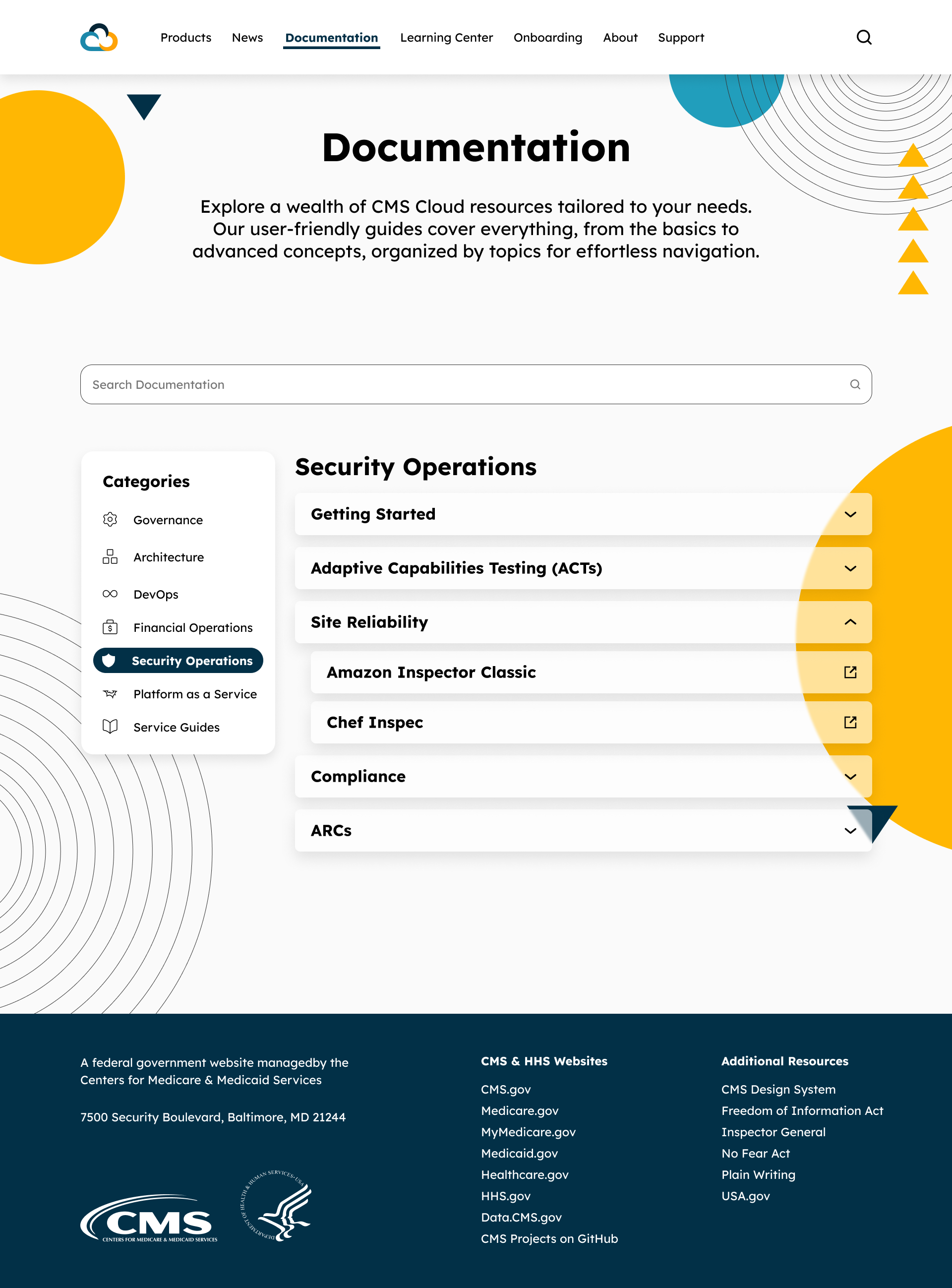
Filtering & On-page Search
The Product Catalog and Documentation pages, each containing a large volume of informational articles, were redesigned to include an enhanced filtering and search experience. Filter categories were derived from insights gathered during the card sort activity, reflecting how users naturally group and look for content. In addition to filtering, a dedicated on-page search feature was introduced which allow users to search specifically within these sections rather than relying on a site-wide search. These updates enabled users to quickly narrow down products, services, and documents, reducing excessive scrolling and effort, resulting in a more efficient and focused browsing experience.


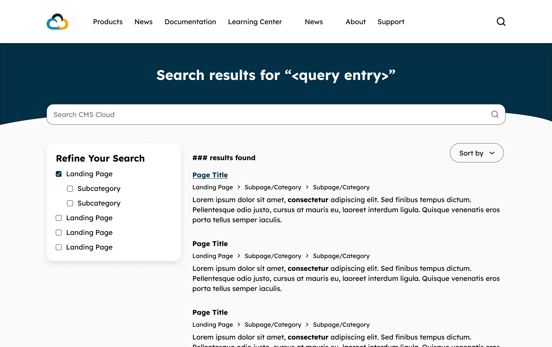
Site-Wide Advanced Search
An upgraded site-wide search was implemented to better accommodate users’ diverse browsing behaviors and intentions. Previously, the search function only returned results when users entered exact page titles which led to incomplete searches and frustrations. The redesigned search feature now scans page content to match user queries more intelligently, providing relevant results even when keywords differ from page titles. Additionally, an advanced search page was introduced which allow users to filter and refine results by landing page, categories, and or sort by relevance or date.
Usability Testing Insights & Feedback
Once the website MVP was deployed in a test environment, I conducted usability testing to identify any usability issues and validate that the new designs effectively addressed user pain points. A total of 25 participants took part in the study, each representing key user groups. During testing, users were given five tasks reflecting critical use cases and were assessed based on successful task completion. To capture quantitative insights, participants rated the difficulty of each task on a seven-point scale, generating Single Ease Question (SEQ) scores. They also completed a 10-item Likert-scale questionnaire to measure perceived usability and satisfaction, resulting in a System Usability Scale (SUS) score.
Results Insights
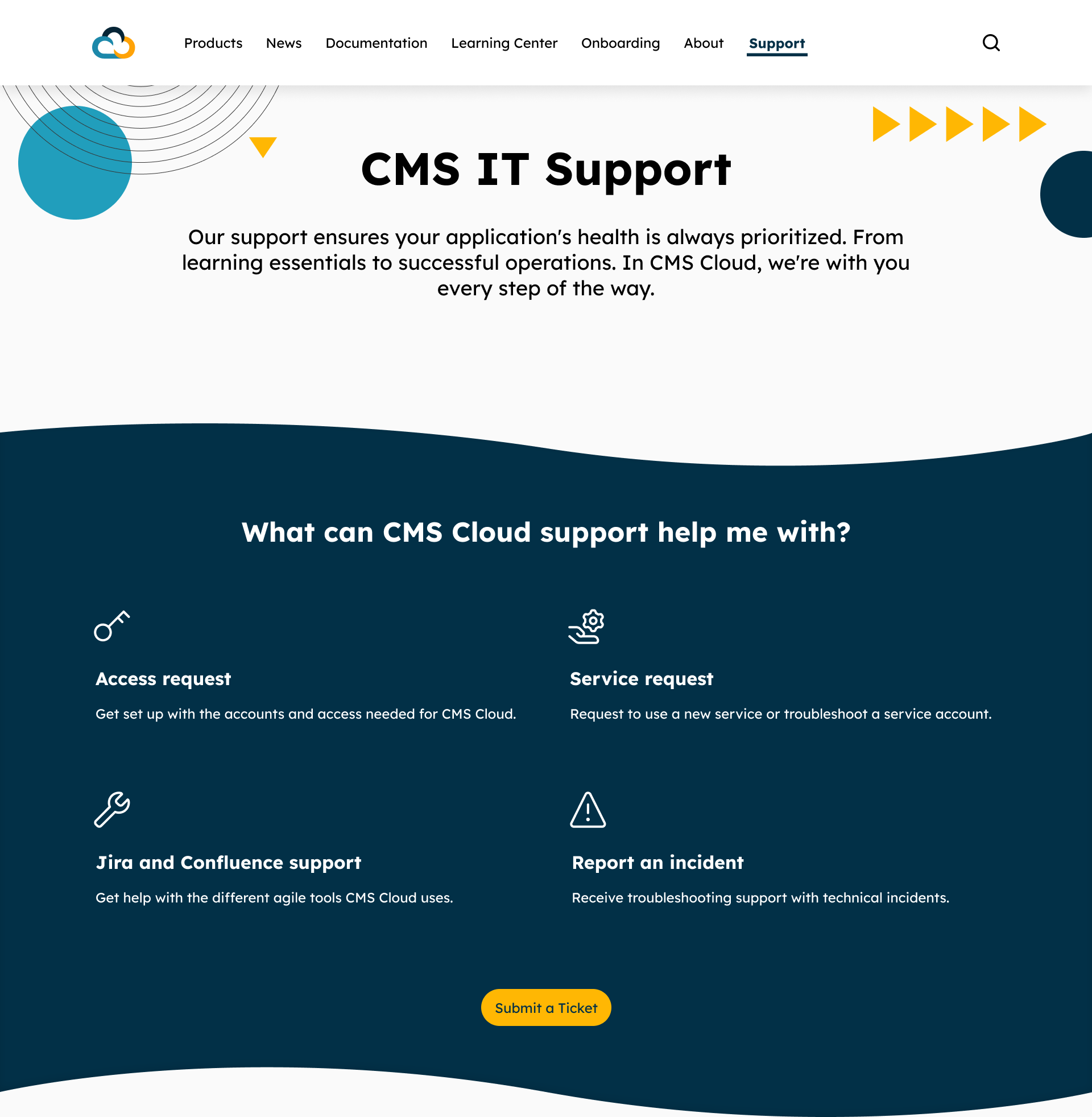
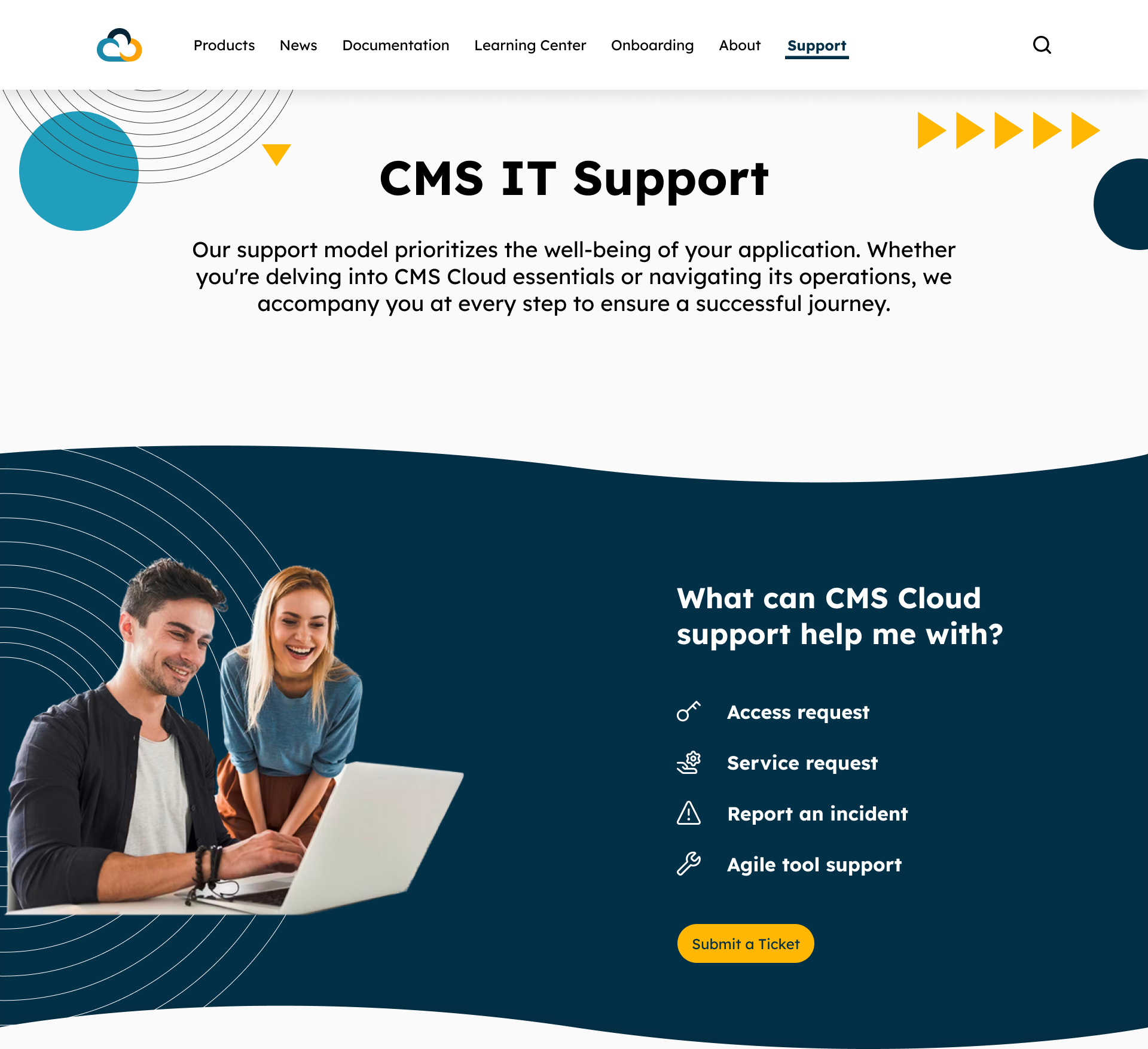
- 100% of participants were able to complete all tasks, validating that the redesigned information architecture and interface enhancements effectively resolved previous navigation and content discovery issues
- The average SEQ score was 6.6 out of 7, indicating that users found tasks easy to complete with minimal friction
- The average SUS score was at 89 which places the site in the ‘Excellent’ usability range
- Qualitative feedback highlighted improvements in structure, visual consistency, and search functionality
Testing Summary
These insights confirmed that the redesign not only improved efficiency and satisfaction but also established a strong foundation for future iterations. While the the outcomes were largely successful, a few participants experienced minor delays completing a task due to confusion between visual icons and clickable elements. In response, I decreased the icon sizes to draw greater attention to the section’s primary Call to Action button and reorganized the layout to present the items as a clear list, minimizing confusion over clickable elements.
Feedback Loop & Iterations
After the MVP usability testing, feedback as collected through follow-up interviews, analytics tracking, and internal team discussions. Periodic meetings with CMS stakeholders allowed us to review findings, present new features, and discuss potential refinements. This continuous feedback loop ensured that both immediate usability concerns were addressed and that future updates remained aligned with user needs and stakeholder expectations.
