TranZit
Solutionizing to make public transit more efficient for commuters
Project Overview
Currently in Hawai’i, there isn’t a single all-inclusive platform that commuters can use to receive information about the bus, which is the only source of public transportation. Users would have to use multiple apps to obtain information such as arrival times, bus stop locations, or transportation directions. Enter the Tranzit App, a potential solution to the aforementioned problem. I aimed to design an app that would provide users with all the information that they might need during their commute in one place.
My role was to be a designer in the entirety of the project, spearheading all design initiatives from discovery, planning for the user experience, to executing user interfaces.
research & problem landscape
To fully understand issues with Hawaii’s public transportation and the information being provided to the public, I sought to find what resources people are currently using and the negative experiences or pain points they have with these resources and the commuting process as a whole. After conducting secondary research and user interviews, I found that commuters are using Apple Maps and Google Maps for directions and a local transit application for arrival times.
pain points
- Unfamiliarity with the transportation system
- Unfamiliarity with different locations
- Long or inaccurate wait times on these apps they currently use.
Opportunities
Given the situation at hand, there are different areas of opportunities for an app to address these problems.
- Reduce commuters’ time spent waiting for buses at bus stops
- Make public transportation information more accessible
- Provide directions that are easily navigable
solution Ideation & Wireframes
Reducing wait times at stops
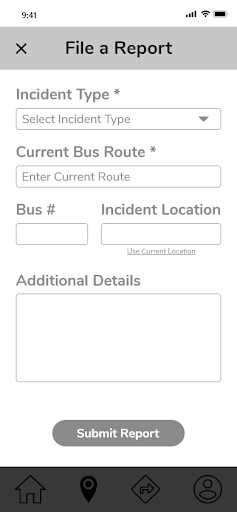
To reduce wait times, I thought to design the application to consistently provide users with recent data. The app will allow users to submit reports of delays or traffic to ensure arrival times displayed are as accurate as possible.
Make information more accessible
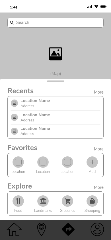
A solution to make public transit information more accessible is to allow users to search for routes, bus stops, or navigation directions through a variety of ways. For example, being able to search by cities, landmarks, find bus stops along navigation routes, and to search through a general map area.
Easily Navigable Directions
Providing navigable directions can be done by implementing a feature that will allow users to choose from various navigation routes. Whether it’d be a route that has a bus arriving the soonest or selecting a route that will bring the user closest to the destination, commuters can choose the route that will best suit their needs.
With these solution ideas in mind and insights from guerilla usability testing, I began to design wireframes for the app. I designed screens to reflect the three features discussed above; filing a report, viewing all bus stops and route information, navigation directions, and an intuitive search. Below are key screens for these solutions.

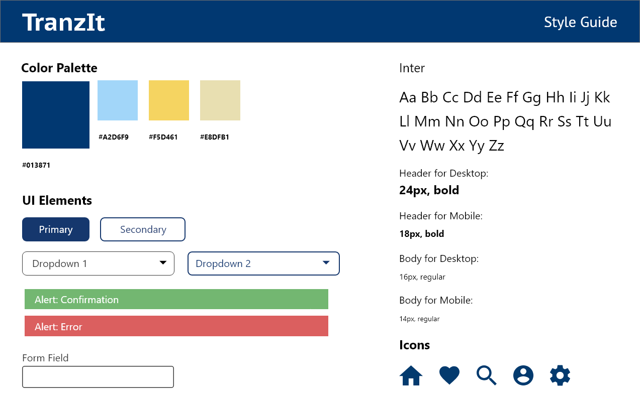
Brand & styling
I defined the application’s brand platform to facilitate styling. The name of the app, Tranzit, comes from its purpose of assisting Hawaii’s commuters with utilizing public transportation. It is a combination of the word ‘transit’ and a common Hawaii greeting, “Howzit.” Tranzit is meant to provide ease to users during their commute, so the brand’s attributes are reliable, accommodating, painless and inviting.
To reflect the app’s brand I decided to use shades of blue and yellow. Blue is associated with stability and reliability making it an ideal choice for Tranzit. Yellow brings the feeling of positivity and happiness which will create a welcoming and uplifting atmosphere. Tranzit’s user interface elements carry on the brand’s attributes by having slightly rounded corners which provides a warm and welcoming feel.
Prototyping
Filing a Report
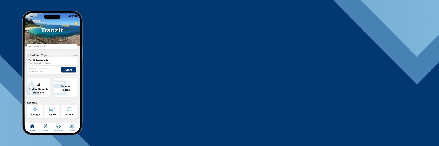
One feature included in the prototype is filing a report. From the homescreen, which acts like a personalized dashboard, users can visit a reports page. The reports page will display any incident reports near their area and also allow users to add a report.
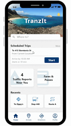
Providing updated transit information
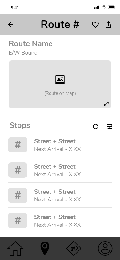
Providing users with accurate wait times and allowing them to search by bus stop or bus route was another feature implemented into the prototype. Through the arrivals landing page, commuters can choose which search method they prefer and once they click on a route or bus stop, they are provided with arrival times for all buses or bus stops.
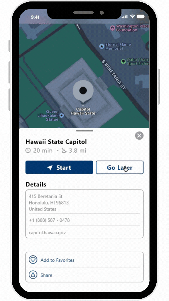
Navigation directions
Users were also able to go through the motion of obtaining navigational directions. Through the Direction landing page, they were provided a given location to mock up searching for a destination. Then users are taken to the location page where they were given an option to start the navigation or schedule a trip for later. If they decided to start the navigation, they were taken to a route selection page and when selected, the navigation directions would then start.
Alternatively, if users were to select the ‘Go Later’ option, they could also go through the motion of being able to schedule a trip for a later time.

Usability Testing Feedback & Insights
Although all participants were able to complete all tasks during usability testing, I was able to receive feedback and find areas of improvement. On many screens, there were ‘More’ buttons in gray that were too light that users could mistake as inactive rather than a button. To finalize the app’s design, I made the ‘More’ button slightly darker so that its state does not look inactive but it also would not be confused for regular text. All other screen designs remained the same.
Aside from the ‘More’ button, there were no other usability issues that would affect the main functionality of the application. Other feedback mentioned by participants was the potential risk for some icons to be confusing for older demographics or those who are not tech-savvy.
Learns & Future Iterations
Having to design an app in its entirety has been a good learning experience as a designer. Conducting user interviews and usability tests has allowed me to better understand how to assess behaviors and interactions. This project has also given me the experience of designing screens and learning to use design tools such as Figma and Adobe XD.
While the app in its MVP state functions as desired, there is still room for future iterations to make it even better. Implementing more features such as allowing users to report bugs or any technical issues would improve the app. Doing so would help reduce down times and ensure commuters consistently have access to the app. Other iterations can include design improvements. For example, having more consistency with button padding and using a single icon pack for consistency purposes.
